When you’re designing record sleeves, who is your client? The record company? The band? No, it’s the fans (AKA consumers), according to Malcolm Garrett.
He knows this, because he started out as a fan. “Music for teenagers is about them finding their feet in the world. They take the lyrics and ambience, and they want to be part of that. I took so much from the packaging of (rock band) Hawkwind.”
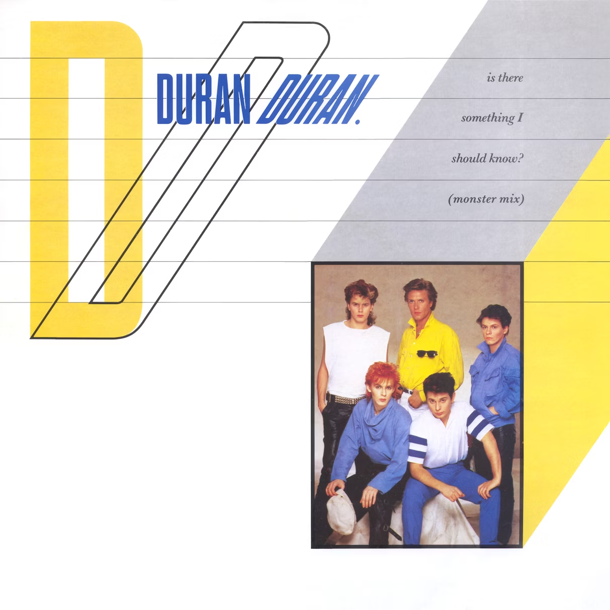
Garrett applied this understanding of fandom to his design work for punk band Buzzcocks in the late 1970s – perhaps his best-known music work – before going on to spend five years creating marketing material, posters, merchandise, the logo and all the record sleeves for New Romantic phenomenon, Duran Duran.
This sleeve work from 1981 to 1986 is getting its first standalone airing in exhibition form at SEA. The idea came about during a brief chat last year between Garrett and SEA founder Bryan Edmondson, who said that a show focusing on Duran Duran was well overdue.

“In a way, the fans brief,” Garrett explains. “Part of the secret of successful music packaging is for the fans to believe that the band does everything,” rather than a graphic designer being employed to create a look.
His career in the music industry started with punk. “I’d become a punk at Manchester Polytechnic. I met Buzzcocks, and started to shape all my college work around what I was interested in – music and lifestyle, though I didn’t think of it as ‘lifestyle’ at the time. I was involved in a direct way in what was around me.”
It’s hard to believe now, but there was no real music industry in Manchester at the time. The Factory Club opened in June 1978, but was not yet a record label.
“There was nothing keeping me in Manchester,” Garrett says, so that year after graduating in graphic design, he set up as a freelancer in London.
He was immediately offered work by United Artists (which was later absorbed by EMI), Virgin Records, and Radar Records, which was part of Warner Music.
“All of my jobs were from record labels,” he says.
By then, Garrett had formed Assorted iMaGes with Kasper de Graaf, who was working at music magazine Smash Hits.
Come 1979, and punk was on its way out, but post-punk was not. “There were a lot of new young bands springing up, and in a couple of years you had post-glam, and kids frustrated with punk wanted something new.”
That morphed into the New Romantic era, which Garrett describes as “a follow-on from the cultural left field in the UK.”
In 1980, he was approached by EMI to design for a new band they’d signed, “who were bubbling under.”

Duran Duran, along with Spandau Ballet were spearheading the New Romantic movement, although Garrett himself was still post-punk – “I never bought myself a frilly shirt,” he admits.
But he describes Duran Duran, and its founding members John Taylor and Nick Rhodes, as radical in their own way.

“Taylor’s influence had been The Sex Pistols’ track Anarchy in the UKand a song by disco band Chic. He had this idea that his band should be a merger of the two – dance-orientated and futuristic mixed with we’re-in-control-of-our-own-destiny rebelliousness.”
For the band’s first single, Planet Earth, there was no brief.
He hadn’t met the band yet, so he went to see them play live, then had “a very short space of time” to come up with the goods.
For the design he cut landscape images out of National Geographicmagazine. “The graphic references were futuristic airlines, and the aerial photos butt up against each other on the sleeve.”
For the follow-up single, Careless Memories, he shot images with the band’s stylist Perry Haines, and put them in the same layout. “It was instinctive,” Garrett says.
While the first few records all had the same grid structure, there was a lot of “to’ing and fro’ing” about what imagery he should use.
“I would be given a photograph, then my job became to make it fit seamlessly into a flow of things, to give the sleeves a consistency,” he explains.
Garrett saw his role as ensuring the fluid evolution from one image, and one era, to another.
Of the five band members, the most engaged in visual arts were Rhodes and Taylor, who had done one year of a foundation course.

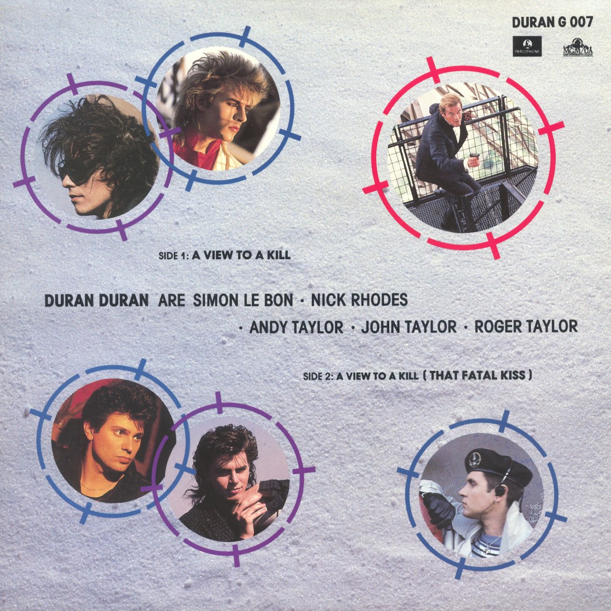
“They had knowledge and understanding. There was a lot of mutual agreement, as the sort of things they liked coincided with what I liked,” he says, citing a shared love of Andy Warhol and James Bond.
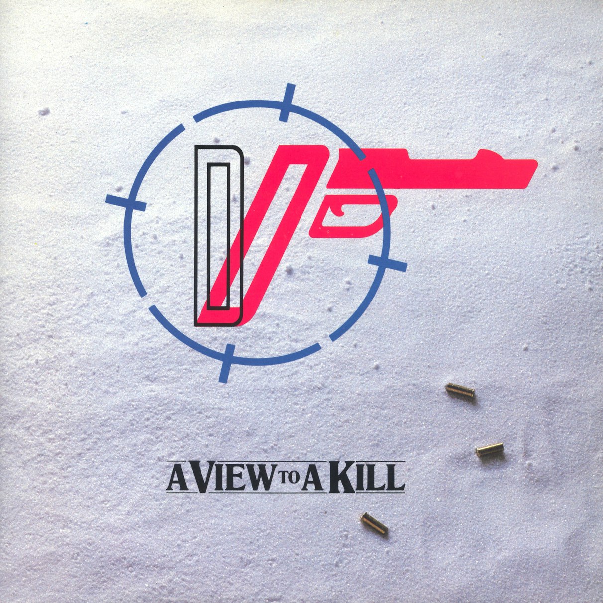
(The band would record the theme song for Roger Moore’s last Bond outing in 1985’s A View To A Kill. Legend has it they got the gig after Taylor drunkenly approached Bond producer Albert “Cubby” Broccoli at a party and asked when he was going to get “someone decent” to do the Bond music.)
Taylor and Rhodes would often bring creative ideas to the table. He recalls the Reflex sleeve came from a conversation with Rhodes about constructivism.
The band was a tight unit, but through working together so closely, Garrett was admitted into the inner circle.

“At some point I was allowed in, to a certain degree,” he says.
“My instincts matched theirs, and I can’t recall having to submit ideas that were discussed or thrown out or modified.”

Despite these shared instincts, the collaboration thrived on proximity.
Seven and the Ragged Tiger was recorded in Sydney, while Garrett was in London.
“I was submitting thoughts and ideas around a furry, tiger-y, powerful feeling. But we weren’t getting anywhere.”
He and the band needed to be in the same room. “By the end of the week, I was in Sydney.”
With its exotic maps and symbols, he describes that cover as full of bewildering esoteric detail, with apparent depth.
He fought not to have a band photo on the front covers, believing it was the job of the press to promote them. And besides, a band’s image changes all the time, he says.
Instead, he saw the sleeves as packaging which should convey brand cues in the same way a desirable consumer product would.
“It should have the necessary potency but be suitably timeless,” Garrett explains.

He got to prove this point with the album Rio, which features a Patrick Nagel painting, and sold more than any other Duran Duran record.
“I had to have more components, so I framed it and wrapped it round the open edge of the sleeve. I took colour references from the image and what the band was wearing in the photos, and introduced the typeface and diagonal lines.”

This visual approach then shaped the designs for the singles too. “I would have some stuff to work with, enough visual hooks so it could always feel fresh and new, yet still connected.”

Through these experiences he came up with two rules. The first was to keep sleeve design as simple as possible at the start of a band’s career “because you don’t know which direction they’re going to go.” Hence the mainly white, cool, non-committal cover for Planet Earth.
The second was to “ensure there are enough visual components that you can take one or more onto the next sleeve.” For Duran Duran, that was the grid.
He later took a similar approach with Simple Minds and Culture Club, and that gave him enough tools in the toolbox.
“While bands know what overall direction they’re taking, the specifics can be quite flexible, as they respond to things like market forces, evolving musical plans, new songs and tour opportunities. Because the best ones, and that includes Duran Duran, are always in the driving seat.”
Assorted Images at SEA, Malcolm Garrett x Duran Duran is on 20 March. This Duran Duran collection was loaned by Covet The Cover.